In summarizing 2014 investment results, “scraping the bottom” emerges as a common theme. This follows the previous issue of General ReView that focused on the continued decline of fixed income returns, deteriorating credit quality and the penchant for increasing risk assets. We thought it would be helpful for readers to understand how closely the behaviors of individual companies tracked industry averages and trends in 2014.
This General ReView’s first section highlights the wide variation among companies’ insurance results. The second section details the investment portfolios, presenting more advanced investment analytics that draw upon our proprietary cusip level holdings’ return and risk metrics database. The final section looks ahead to present the building blocks of prospective investment returns and yields as a precursor to our next issue. Without meaningful and sustained capital market yield increases it would appear that earned investment income and embedded book yield will continue to decline.
Insurance Results
We rely upon multiple metrics to summarize insurance results. These include the combined ratio, premium growth, reserve development and reinsurance effectiveness. The two panels of Chart 1 display combined ratios, premium growth and combined ratio volatility. As noted in General Review Issue #70, the industry’s reported 2014 combined ratio was 97.2, or a three-year average of 98.9. Net written premium increased by $40B, resulting in a three-year rise of 13.5% from year-end 2011.
However, as can be seen in the left panel of Chart 1, “averages” are misleading indicators of individual company results. The preferred quadrant of depicting combined ratio versus premium growth is the southeast quadrant: a low combined ratio and high growth, a target of aspiration but a difficult position to sustain. The upper reaches of the northwest quadrant have the appearance of an exit strategy: high combined ratios and declining premium.
Chart I. Combined ratio, premium growth and combined ratio volatility
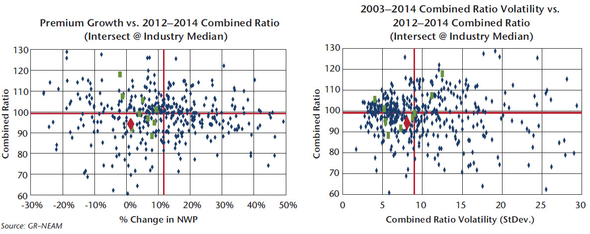
The right panel of Chart 1 displays recent combined ratio averages versus 12-year combined ratio standard deviation as a measure of underwriting volatility. In this panel, the preferred position is the southwest quadrant: lower combined ratios and lower combined ratio volatility. The northeast quadrant is the least desirable position: high combined ratios and high volatility.
Chart 2 illustrates reserve development. The left panel displays three-year loss ratio development in contrast to the reported three-year calendar year combined ratio. The overwhelming majority of companies recorded “favorable” loss development—and, more importantly, few companies have both “adverse” development and calendar year combined ratios of less than 100. Ultimately, reserve redundancies are depleted, if indeed they were planned during the initial reserve period.
Chart II. Combined ratio, reserve development and loss ratio development volatility
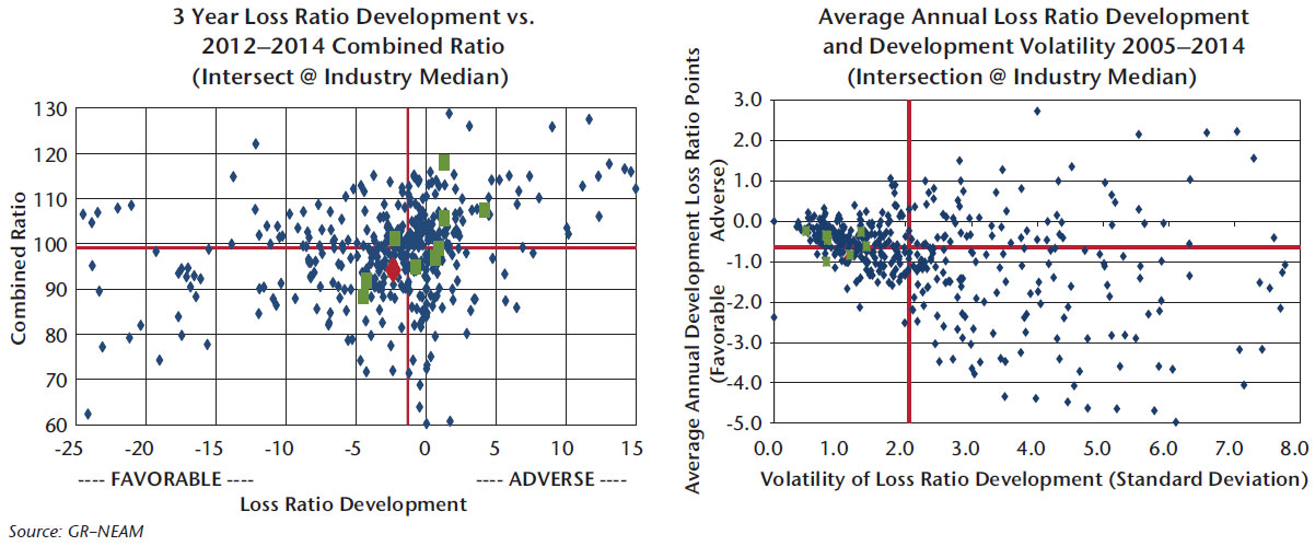
The right panel of Chart 2 shows the average annual loss ratio development compared to its standard deviation. For the most recent 10 years, the average annual reported loss ratio development has been favorable for the overwhelming majority of insurers. And, for most insurers with high(er) volatility, the associated average of annual development has been favorable (less than zero). Although not shown, the reserve-weighted average of annual loss ratio development is not significantly different for the numerical average or median (size does not matter). However, the weighted volatility is less than half the average.
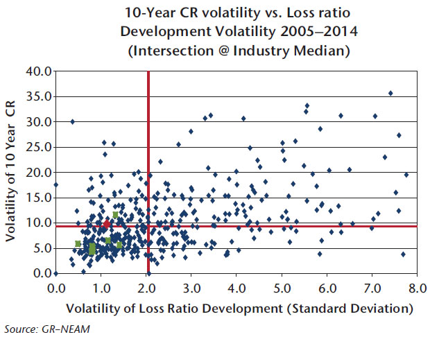
Chart 3 contrasts the volatility of reported combined ratios to the volatility of annual loss ratio development. The volatility of annual loss ratio development does not appear to be a significant contributor to the volatility of reported combined ratios. Rather, its underlying causes may be more correctly attributed to the random behavior of the claims process and individual company underwriting and pricing practices.
Chart III. Volatility of reported combined ratio and loss ratio development
Another driver of reported calendar year results is the incidence of reinsurance. Chart 4 summarizes reinsurance effectiveness over the 10-year period ending 2014. Reinsurance can be purchased for many purposes such as to dampen volatility, mitigate impact of severity or catastrophe losses; or to support clients’ required limits or coverage needs. However, regardless of its purpose, the focus should be on how effectively the reinsurance is utilized.
Chart IV. Reinsurance effectiveness (combined ratio impact)
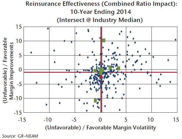
We measure the effectiveness of reinsurance utilization based on its impact upon underwriting profit margins (essentially 100 minus the combined ratio) and margin volatility. For companies “east” of zero margin volatility, reinsurance reduced the net underwriting volatility, deeming its impact as favorable with respect to that metric. For companies “south” of zero margin improvement, reinsurance increased the net combined ratio leading to an unfavorable impact.
The results in Chart 4 demonstrate the wide variation in outcomes among companies as return/risk trade-offs unfold following reinsurance purchase decisions. The least favorable outcomes in margin and margin volatility impact are for companies operating in the southwest quadrant. The northeast quadrant, while being the most desirable, might not be sustainable. Northwest and southeast quadrants represent a range of return/risk trade-offs in which cedants would need to assess the value of dampening underwriting volatility or achieving other underwriting objectives relative to the cost of net underwriting margins.
Portfolio Details
Chart 5 shows the book yields and risk for individual companies’ taxable and tax-preferenced fixed income portfolios. “Risk” is defined by a measure of option-adjusted credit duration tallied from each company’s individual cusips. The most preferred quadrant is the northwest; the least preferred is the southeast. The wide variation among companies’ book yields is due to a myriad of reasons. These include the securities’ purchase dates (and the yield environment at that time), the maturity/duration of the securities at the purchase date, the gains-taking practice of the company and individual security selection. Note, relative positioning evolves with the passage of time as bonds mature, pay down, become called or are sold.
Chart V. Book yield versus risk for taxable and fixed income portfolios 2014
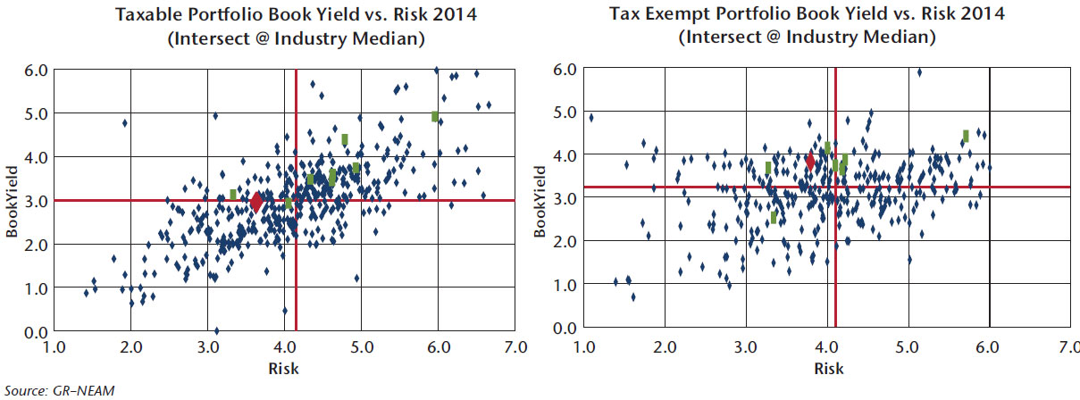
Of particular note is that the median (and weighted and numerical average) tax-exempt book yield continues to exceed the corresponding taxable book yield. The yield gap first appeared in 2012 even as duration differentials narrowed from over three years to less than two years, and taxable bond credit quality remained one to two notches below municipal bonds.
It is very difficult and tedious to calculate total return for insurers’ fixed income holdings from publicly available sources, and clearly it is not possible unless the results are tallied from individual cusips and transaction detail.1 However, as shown in Table 1, coupon drives total return and price spawns volatility. Accordingly, at first glance, book yield can provide a good indication of relative total return performance over long(er) periods of time.
Table I. After-tax total return 1997 – 2014
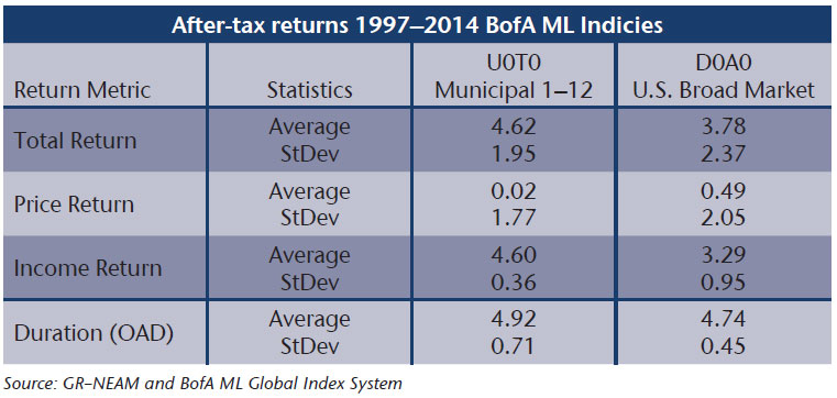
We previously noted the evolving pre-tax book yield dominance of tax-exempt versus taxable bonds. On an after-tax total return basis, their advantages are even more pronounced, as shown by the results in Table 1. Further, in 25 of the past 28 years the tax-exempt index posted higher after-tax total returns than taxable broad market index. Neither duration nor the distribution of credit quality is a cause of the differentials.
Chart 6 summarizes the five-year trend of taxable fixed income securities for the industry, the target company and its “peer” group. The data helps to isolate individual company, peer group and industry responses to the decline in market yields. In this case, the underlying cause of the upward drift in the industry composite taxable fixed income risk appears more to be credit migration rather than duration extension.
Chart VI. Taxable bonds trends in book yield, duration, credit quality and risk
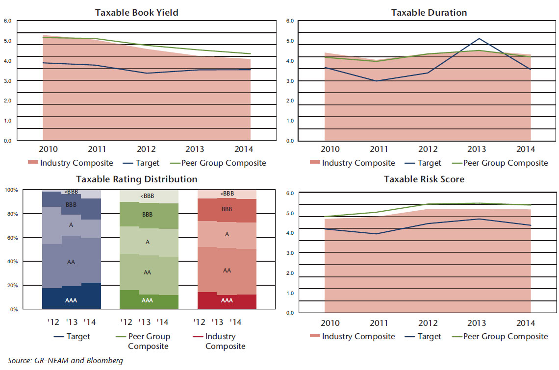
Chart 7 displays similar metrics for the tax-exempt bonds as shown for taxable holdings. In this case, duration shows a downward drift, and industry risk appears static. There is a slight uptick in credit quality (nearly imperceptible in these charts). This obscurity highlights the importance of credit duration tallied to portfolio totals from individual cusips rather than as calculated from portfolio averages.
Chart VII. Tax-exempt bonds trends in book yield, duration, credit quality and risk
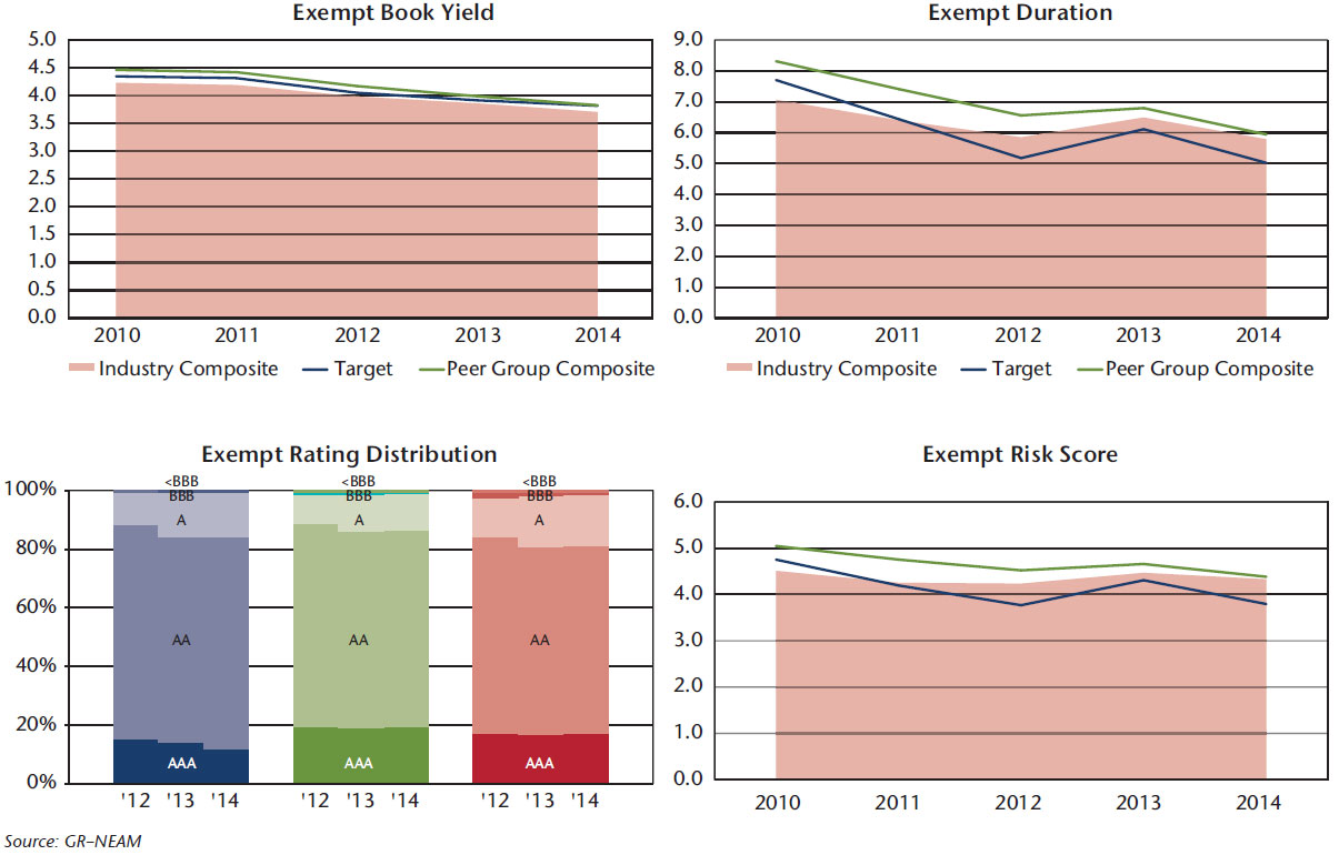
Chart 8 displays the corporate and tax-preferenced municipal bond credit quality by duration category as of 2010 and 2014. We focus on these two sectors because they represent about two-thirds of fixed income holdings and the preponderance of credit risk. With respect to corporate holdings, BBB allocations increased five percentage points, but only had a slight impact on credit duration. In the case of municipals, there was a pronounced shift within the AAA/AA categories, a marked uptick in single-A holdings and a decline in BBB rated securities. Results vary greatly by individual group.
Chart VIII. Corporate and municipal bond credit/duration profile 2010 and 2014
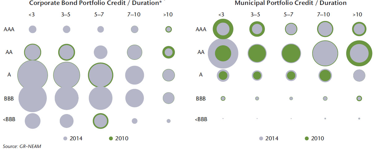
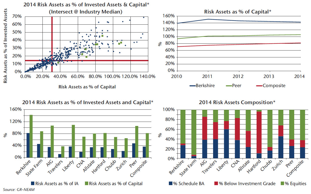
Chart 9 focuses on “risk” assets, which are defined as common and preferred equities, below investment grade fixed income assets and schedule BA holdings. The latter are most often referred to as “alternative” investments and comprise a variety of asset types, risk and return profiles. The common denominator of “alternatives” is illiquidity.
Risk assets are displayed as a percent of invested assets and capital. We show the composition of risk assets and their trend over time. The ownership of risk assets is broad, although for “alternatives” it is very concentrated and represents a small share of risk assets that is disproportionate to the attention it receives from its purveyors.
Chart IX. Risk assets
Looking Ahead
Chart 10 summarizes the asset allocation, fixed income sector classification and duration and rating metrics as of year-end 2014. The current investment holdings (and capital market prospective return opportunities) represent the primary building blocks of future investment income and total return. As shown, individual companies and groups can display wide deviation from industry averages.
Chart X. Asset allocation, fixed income classifications and duration and credit rating metrics
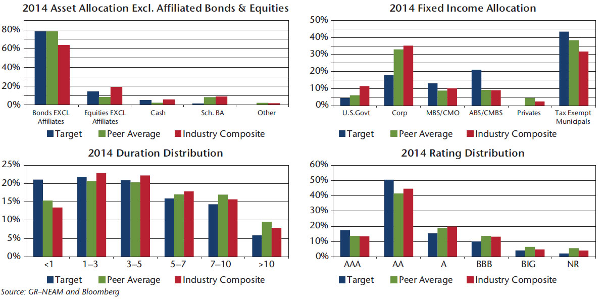
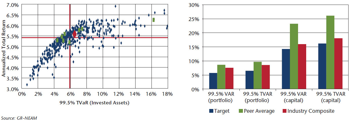
Chart 11 displays the estimated asset only Tail-Value-at-Risk (T-VaR) at the 99.5 confidence level. The left panel plots an estimate of each group’s expected after-tax total return on assets and T-VaR based upon its year-end asset allocation. The right panel displays T-VaR as a percent of the portfolio and statutory capital. The scatter diagram demonstrates the wide variation among companies, while the bar charts show the importance of expressing investment portfolio T-VaR as a percent of capital.
Chart XI. Annualized expected after-tax total return and estimated 99.5 T-VaR
The T-VaR metrics provide a measure of assessing downside risk. Another view of possible futures is to focus upon total returns. Chart 12 displays two differing views of future total returns. The left panel displays the annualized expected total return if spreads reverted to their long-term (1997–2014) mean over the next 36 months. The median taxable bond total return exceeds its current book yield by nearly 100 basis points as shown in Chart 5, suggesting considerable unrealized gains due to previous purchases of high(er) yielding (and cheap) bonds than are currently available in today’s capital markets.
Chart XII. Mean reverting total return and horizon returns–taxable bonds only
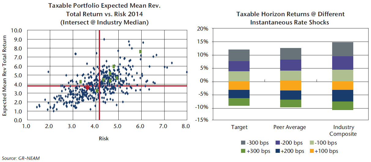
The right panel of Chart 12 shows the one-year horizon total returns resulting from an instantaneous rate change. These outcomes are calculated from the portfolio’s coupon, duration and optionality. The latter is the cause for asymmetric return results in up/down rate change environments. Note that a 200 bps increase results in a total return loss of nearly 7.5% for the target company. This is only slightly more than the 99.5 portfolio T-VaR of 6.5% shown in Chart 11. Similar charts are available for tax-exempt holdings.
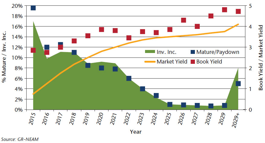
Within this section, we leave you with one final thought for consideration. Chart 13 displays book yields of the industry’s taxable holdings for bonds as they mature or pay down compared to the term structure of benchmark index current yields at year-end 2014. The blue squares represent the percent of the current taxable holdings which will mature or pay down in the future, while the gold squares represent the associated book yield of those holdings. The green area displays the annual earned investment income that will roll off each year. The red line is the market yield term structure of AA/A corporate bonds. The AA-A corporate bond index has the approximate average credit quality as the industry’s taxable holdings.
It is clear that book yield and investment income will continue to erode unless prospective rate increases “yield” a favorable combination of magnitude, sustainability and curve shape. Over the next three years, taxable book yield run-off averages nearly 300 bps. In today’s rate environment, without lowering credit quality, those levels of yield are achievable only by re-investing at the longer end of the term structure; for example, at the 8 to 10 year part of the curve which, after accounting for curve roll on the remaining holdings, the 2015 duration would increase nearly 0.8 years from the 2014 current level of 4.3 years. This is a potential outcome that would give us pause.
The situation for municipal holdings is similar. We will explore these prospective impacts in the next General Review when we address Property/Casualty investment returns and provide for an “accounting” of operating cash flow.
Chart XIII. Industry taxable holdings and yield run-off and benchmark market yield
Summary
Our summary is as follows:
- Industry premium income has increased over prior periods. Combined ratios are favorable, but they hover in the upper 90s buoyed by lower catastrophes and beneficial prior year effects. Apart from concerns of sustainability about the latter two conditions, we note wide variation among companies.
- Capital has continued to increase due to favorable equity returns and positive underwriting results. This is suppressing operating and investment leverage and trapping return on equity at single digit levels.
- Fixed income book yields continue to decline as higher yielding securities are sold (especially tax-exempts) and/or matured and capital market replacement opportunities erode.
- Low-embedded yields, the maturity structure of portfolios and nominal operating cash flows will significantly extend the time to restore fixed income assets’ yields and earned income.
- Without meaningful and sustained capital market yield increases, it would appear that earned investment income and embedded book yield will continue to decline. This assumes no further reductions in credit quality or meaningful increases in duration.
The next General ReView for the Property/Casualty industry will address the long road to restoring fixed income book yields and investment earnings. With expectations of increasing interest rates, we will provide our view of possible capital market scenarios and (the vagaries of) insurance operating results. Clearly, on many dimensions this is not Lake Woebegone.
As always, we welcome your feedback and comments. Please contact us if there are investment themes you would like us to review or if you would like to receive a comparative assessment of your investment portfolio and its preparedness for the slog ahead of us all.
Endnote
- However, the next edition of General Review will present our estimates of individual groups’ (after-tax) total return of fixed income holdings from our multi-year cusip holdings database.
GR–NEAM’s portfolio management tools utilize deterministic scenario analysis to provide an estimated range of total returns based on certain assumptions. These assumptions include the assignment of probabilities to each possible interest rate and spread outcome. We assume a 12 month investment horizon and incorporate historical return distributions for each asset class contained in the analysis. These projected returns do not take into consideration the effect of taxes, changing risk profiles, operating cash flows or future investment decisions. Projected returns do not represent actual accounts or actual trades and may not reflect the effect of material economic and market factors.
Clients will experience different results from any projected returns shown. There is a potential for loss, as well as gain,
that is not reflected in the projected information portrayed. The projected performance results shown do not represent the results of actual trading using client assets but were achieved by means of the prospective application of certain assumptions. Results shown are not a guarantee of performance returns. Please carefully review the additional information presented by GR–NEAM.


